5 Landing Page Variants You Should Test in Your Next Campaign
Key takeaways
Landing pages focus the attention of visitors on a single goal, like signing up, starting a free trial, or making a purchase. These pages often lack distraction, being totally tailored to a specific aim.
Depending on your approach, this sort of highly targeted page can help you convert leads through specific outcomes like being highly engaging, trustworthy, or catering to more qualified leads.
For instance, story-led landing pages can strengthen your credibility, while demo-first pages can motivate leads who need a final nudge towards conversion. Plus, landing pages with a quiz or assessment can feel extremely personal and unique to engage with.
Even if you’re not sure what will motivate your audience best, trialling different formats can illuminate this.
This article will discuss 5 variants of landing pages, each with a different focus, to inspire your next campaign. We’ll explain the value of each and give some advice about executing them effectively.
Let’s dive in.
5 landing page variants to test
Each of the following landing pages has a different focus. You may feel hesitant to ‘limit’ landing pages to such specific formats, but this can be tremendously effective. If you were to cram as much into your landing pages as possible, many users would be overwhelmed and distracted.
Though it may feel like you’re limiting yourself, trying out a highly specific format is a sure way to be focused and effective:
Quiz-driven
A quiz-driven landing page is a highly engaging, gamified way to promote certain products, services, or solutions to users. After answering a few questions about themselves, users are then recommended a personalised solution.
This approach can be used by a wide range of business types. You could be promoting certain digital services, holiday packages, or a unique shampoo formula.
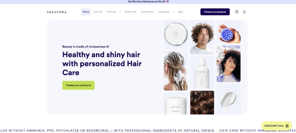
Shampora is a great example of the latter, guiding visitors through a questionnaire about their hair and scalp health and preferences. At the end, users have unique formulas for shampoo, conditioner, and other hair products they can purchase:
This approach makes the final offering so much more compelling. Firstly, because users know it has taken their preferences and needs into account, but also because it’s like a reward at the end of a game.
Using this type of landing page can provide you with longer time on page, better-qualified leads, and more information about audience preferences. As well as leading users to an opportunity to convert, quizzes also provide you with market research that can later inform marketing messages and product development.
To execute this type of landing page effectively, consider the following advice:
- Quizzes that aren’t too long will keep visitors engaged. You could trial quizzes of different lengths to find out the optimum number of questions you can include.
- Personalisation should be genuine, so make sure you’re actually able to provide unique outcomes for users. If you only have 2–3 variations of product or service, this option may not be for you.
Demo-first
Demo-focused landing pages show instead of tell, inviting visitors straight into the action of their product or service. It could be a preview of an app in motion, an interactive dashboard users can explore, or a video tour where you’re walked through a service. Often, landing pages that offer demos will ask for a name and email address first, but they don’t have to.
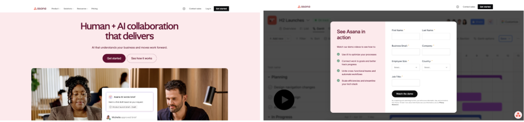
For example, Asana asks visitors to input some key details before they can access the demo of their project management tool:
Though gathering that personal information is highly useful, it could inhibit some audiences who are hesitant to hand over their details. This could be something you trial to see how many users you lose by asking them to fill in a brief form.
When a demo is offered immediately, it can be very powerful. Users can quickly gain an understanding of how intuitive, quick, or effective your product is. Demos can satisfy their curiosity or build confidence in your offering. While other landing pages may ask audiences to imagine these things, demos provide proof more tangibly.
Demos tend to attract leads that are closer to making a decision. Those that aren’t so warm are unlikely to spend too long trialling a product, instead requiring more persuasion about their pain points. If you do decide a demo-focused landing page is what’s needed, bear the following in mind:
- Avoid burying your demo under lots of dense writing. Keep it simple, and display the demo in the most visible way.
- Keep your demo fairly short. Those that are long or unstructured can lose attention very quickly. Ensure your video or interactive snippet contains the main features of your offering (those that are most likely to persuade leads).
Long-form story
Instead of pushing visitors to a quick decision, landing pages with a long-form story take them on a steady journey. These types of pages build a narrative. They may begin by explaining a problem and how it came about, how your business began, and what it does now to provide a solution.
These landing pages are a great opportunity to include founder stories, customer experiences, product features, and even challenges that you’ve had to overcome. You can really push the boat out with these pages and include several sections.
While slower paced for visitors, story-led pages are more emotionally engaging. If you want them to connect with your brand on a human level, these pages are an apt choice.
Plus, story-led pages are often necessary to build trust, justify a higher price point, or explain a complex service. Businesses that opt for these types of landing pages are able to convey their credibility, differentiate themselves from competitors, and show off real-world impact.
To execute this landing page format effectively, consider the following advice:
- Follow a narrative structure. For instance, a challenge in the beginning, a discovery or solution in the middle, and an outcome or call to action at the end.
- Use photos, videos, graphics, and colours to guide visitors through your story. They’re extremely unlikely to stay engaged through walls of solid text.
Video call-to-action
As the name suggests, some landing pages can centre around a video to persuade visitors. Through motion, images, and voice, businesses can communicate with leads in ways that written text does not afford.
Instead of scrolling through the landing page, visitors are invited to watch a video (that’s often quite short) that demonstrates their product or tells a story about their brand. Effective videos make viewers see, hear, or feel a compelling impact.
For Intrepid, the small group tour operator, this means appealing to solo travellers with their inspiring clip:
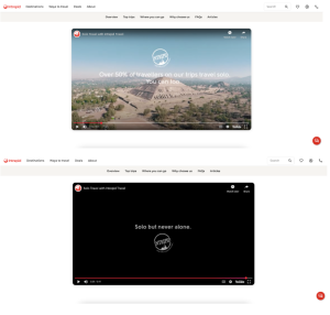
While their video is short and doesn’t give a great deal of information about their specific tours, locations, or deals, it captures an empowering feeling that people may need to feel confident about travelling alone. Once inspired, visitors can scroll down the landing page to read more about Intrepid’s offering.
Some users will find videos much easier to absorb compared to static content, especially those who skim or multitask. Videos also give businesses the opportunity to convey more authenticity and confidence through facial expressions and tone, which written content does not offer. This can build greater trust: a felt sense that is more permanent and visceral for users.
Businesses that utilise video call-to-actions can expect improved conversion rates because they provide proof, personality, and storytelling in one concise experience. You may benefit most from this landing page format if you’re about to launch something, explaining a complex product, or providing a service where human interaction is key.
To create an effective video landing page, heed the following advice:
- Keep your video short, such as between a minute or two.
- Maximise the impact of the first few seconds of your video by leading with clear benefits or expectations.
- While videos should be polished, anything that’s overly scripted or corporate may feel cold.
- Integrate your CTA throughout the video and repeat it below.
Fast action offers
Our final landing page variant is one that’s built for urgency: the fast action offer. Designed to capture attention, communicate instant value, and persuade visitors to take quick action, these pages are used for things like launches and short-term offers.
If you choose to utilise this type of landing page, you’re likely to use short copy, countdown timers, and clear incentives like discounts, bonuses, or exclusive access. Every part of the landing page conveys the message that visitors will miss out if they don’t take immediate action.
As a business, you’re likely to drive conversions and clear up decision bottlenecks, capturing audiences while their intent is high. As well as the uses listed above, you could use the fast action offer to test offers, gauge demand, or reactivate dormant leads.
To be effective, these pages should:
- Be optimised for speed. Your page should load quickly, forms should be minimal, and there must be no friction at checkout.
- Use countdowns authentically. If customers find out the countdown was fake or exaggerated, they’re likely to lose trust in you.
- Have an unmistakable CTA. Ensure it’s concise and impossible to miss.
Final thoughts
While you ponder which landing page format will suit your next campaign best, we’d like to offer you some reassurance. If you need support with executing your marketing strategy, our team here at purpleplanet is here to help.
We’ve been helping businesses meet their digital needs for 20 years, providing customised solutions every time. Browse our services to learn more: purpleweb for web design and development, purplecart for e-commerce needs, and purpleseo for organic visibility. Alternatively, arrange a no cost call with us today to discuss what’s on your mind.